


Ideas for a soothing color palette for a cozy home
- Mar 1
- 7 min read
Creating a comfortable home isn't just about architecture or furnishings. The choice of colors plays a fundamental role in the perception of well-being, relaxation, and harmony in everyday life. In a context like Quebec, where the seasons are distinct and the winters long, designing a soothing interior environment becomes even more essential.
At Plan Maison Québec, we assist clients daily in designing plans for houses, cottages, and garages. The thoughtful integration of color palettes is an integral part of a successful project. A good palette isn't just about aesthetics: it influences the ambiance, the lighting, and even the mood of the occupants.
In this article, we invite you to discover ideas for soothing color palettes, inspired by current trends, to create a comfortable, harmonious living space adapted to the Quebec lifestyle.
The importance of colors in the comfort of a home
Colors have a direct impact on our emotional and physical state. They influence our perception of space, light, and even sleep quality. Soft, natural hues are known to promote relaxation, reduce stress, and create a serene atmosphere.
In a well-designed home, each room should reflect a specific intention. A bedroom should invite rest, a living room conviviality, and an office concentration. That's why, from the initial design phase, Plan Maison Québec incorporates considerations of the overall ambiance of the spaces.
A soothing palette often relies on a balance between neutral colors, natural shades, and subtle accents. The goal is not to create a monotonous decor, but rather a gentle visual continuity that provides a sense of coherence.

The impact of colors on physical and mental health
Beyond their aesthetic role, colors have a real influence on overall health. They affect the brain, the nervous system, and emotions. This is an aspect that is still too often underestimated in construction and renovation projects, even though it can radically transform the comfort of a space.
At Plan Maison Québec, this dimension is taken into account from the very beginning of the design process. A well-designed home is not just beautiful: it must support the daily well-being of its occupants.
Colors and the brain: an immediate reaction
The human brain reacts instinctively to colors. Some hues can soothe, while others stimulate or even create tension. This reaction is both psychological and physiological.
For example, cool colors like blue and green are associated with nature and stability. They tend to slow the heart rate and induce a state of calm. Conversely, warm colors like red or orange can increase energy and stimulate mental activity.
This means that simply choosing a wall color can influence your stress level or your ability to relax after a workday.

Stress and anxiety reduction
A calming visual environment directly contributes to stress reduction. Soft, natural hues create a sense of security and comfort, helping the body release tension.
Studies in environmental psychology show that a harmonious space can promote relaxation and improve overall mood. Conversely, a visually aggressive or cluttered environment can increase anxiety.
That's why Plan Maison Québec often recommends balanced, nature-inspired color palettes for main living areas.

Influence on sleep and recovery
Colors also play an important role in sleep quality. A bedroom that is too visually stimulating can disrupt sleep onset and reduce the quality of rest.
Shades like pale blue, sage green, or neutral tones promote relaxation and prepare the brain for sleep. They create an atmosphere conducive to relaxation and recovery.
Conversely, overly bright or contrasting colors can maintain a high level of alertness, which disrupts the natural sleep cycle.
In residential projects designed by Plan Maison Québec, the choice of bedroom colors is therefore strategic and carefully considered, particularly in a Quebec context where long winters make rest even more crucial.

Impact on concentration and productivity
With the rise of remote work, designing home workspaces has become essential. Here again, color plays a major role.
Blue is known to promote concentration and mental clarity, while green helps maintain sustained attention over extended periods. These colors are ideal for a home office or study space.
Conversely, an overly neutral or monotonous environment can lead to decreased motivation, while overly intense colors can be distracting.
Plan Maison Québec incorporates these principles into the design of multifunctional spaces to optimize comfort and productivity.

Effects on energy and mood
Colors also influence our daily energy levels. Some hues can energize a space, while others invite calm and introspection.
Soft yellow, for example, is often associated with joy and creativity. Used in moderation, it can brighten a space without becoming overwhelming. Earthy tones, on the other hand, bring a sense of stability and comfort.
Colors also have a powerful symbolic effect. They evoke emotions, memories, and sensations, sometimes unconsciously. This explains why some people immediately feel comfortable in a space, while others feel uneasy for no apparent reason.

A powerful lever for overall well-being
When used effectively, colors become a true tool for well-being. They allow us to create an environment that supports mental health, promotes relaxation, and improves quality of life.
A harmonious home can thus become a sanctuary, a space where we can recover both physically and mentally. Colors, combined with natural light and materials, contribute to creating this feeling of balance.
This is precisely the approach adopted by Plan Maison Québec: designing spaces that are not only functional, but that actively contribute to the well-being of their occupants.
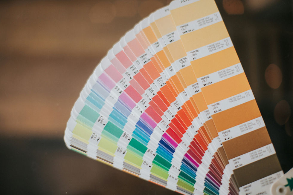
Soothing color trends for 2026
Current trends in interior design emphasize a return to nature and authenticity. Soothing colors are largely inspired by natural elements: earth, water, sky, and plants.
We are seeing increasing popularity of:
sand tones
warm beige
cream and
linen

which are gradually replacing overly cold whites. These shades create a warm and timeless base, ideal for a home in Quebec.
Soft greens, reminiscent of foliage and boreal landscapes, also play a significant role. They bring a sense of calm and connection with nature, particularly sought after in the cottage and vacation home projects designed by Plan Maison Québec.

Powder blues and grey-blue shades evoke serenity and freshness. Used in a bedroom or bathroom, they help create an atmosphere conducive to relaxation.

Finally, terracotta, clay, and rosy brown tones are making a comeback, but in softer versions. They add depth while maintaining a warm and inviting atmosphere.
Create a cohesive color palette throughout the house
One of the common mistakes in interior design is treating each room in isolation. For a harmonious result, it's essential to think of the color palette as a unifying theme throughout the entire house.
Plan Maison Québec often recommends choosing a neutral base color to serve as a foundation. From this base, it becomes easier to add subtle variations from one room to another, while maintaining visual unity.
For example, a living room might be dominated by beige and cream tones, while an adjacent kitchen could incorporate the same base colors with green or wood accents. A bedroom, on the other hand, could introduce a softer shade of blue, while remaining within the same color family.
This continuity is particularly important in open-concept spaces, which are very popular in modern construction in Quebec. A well-thought-out color palette allows you to visually structure the space without creating any jarring breaks.
The influence of natural light in Quebec
Light plays a key role in color perception. In Quebec, light intensity varies considerably with the seasons, directly influencing how colors appear.
In winter, the light is cooler and less intense. Colors that are too pale or too cool can then seem dull. This is why Plan Maison Québec often favors slightly warm tones to compensate for this lack of light.
Conversely, in summer, natural light is abundant. Colors then take on their full richness and depth. A balanced palette must therefore be designed to work year-round.
The orientation of the house is also a determining factor. A north-facing room will benefit from warmer colors, while a south-facing room can accommodate cooler colors without sacrificing comfort.

Soothing color palettes for each room
Each room in the house has a specific function, and the colors should be adapted to that purpose.
In a bedroom, soft shades like pale blue, sage green, or rosy beige are particularly effective for promoting sleep. Plan Maison Québec often recommends avoiding overly bright colors in this space.
In the living room, a neutral palette enriched with natural textures creates a welcoming and relaxing atmosphere. Earthy tones and wood hues integrate perfectly into this type of space.
The kitchen, on the other hand, can accommodate bolder contrasts, while still maintaining a soothing palette. Olive green or soft blue cabinets, combined with light surfaces, offer an appealing balance between modernity and serenity.
In a bathroom, shades inspired by water and stone, such as pale gray, misty blue, or off-white, enhance the feeling of a spa at home.
The integration of materials and textures
A color palette isn't limited to paint. Materials play a crucial role in the overall perception of space.
Wood, for example, instantly adds warmth and harmonizes perfectly with neutral tones. Natural stone, soft textiles, and matte finishes also contribute to creating a calming atmosphere.
At Plan Maison Québec, the design process often includes careful consideration of materials to ensure consistency between the architecture and interior design. A successful color palette relies as much on textures as on the colors themselves.

Personalize your palette while maintaining a calming effect.
While trends offer excellent inspiration, it's important to create a space that reflects your personality. A calming color palette shouldn't be impersonal.
It's perfectly possible to incorporate bolder accents, provided they're used sparingly. An accent wall, decorative accessories, or artwork can add character without disrupting the overall harmony.
Plan Maison Québec supports its clients in this process by offering customized solutions tailored to their tastes, lifestyle, and construction or renovation project.
Conclusion : soothing color palette for a cozy home
Choosing a soothing color palette for a cozy home is an essential step in transforming it into a true haven of peace. In Quebec, where climate and sunlight strongly influence our daily lives, this choice takes on even greater importance.
A well-thought-out color palette not only improves visual comfort but also promotes overall well-being. By combining colors, materials, and light, it's possible to create a harmonious and sustainable environment.
At Plan Maison Québec, we put our expertise at the service of your projects to design spaces that reflect your personality and meet your needs.
Whether you wish to build, renovate or extend your home, our team will support you every step of the way.

This was a useful and easy-to-read post. I discovered Vulcan Hats Construction when looking for home renovation toronto services.